Introduction to Android Bottom Navigation View
Bottom navigation with tabs has been quite a common primary navigation pattern over on iOS for a long time.It enables navigation through a series of hierarchical app screen. Android guidelines already included tabs too, but they were at the top of the screen, combined with swipeable pages, implemented with a ViewPager.
Google officially added Bottom Navigation to version 25 of the Design Support Library and released new versions of its Photos and Google+ app with this component as its main navigation.Let’s take a dive into how we can use it!
I made a really simple app, you can find it from GitHub
I made a really simple app, you can find it from GitHub
Usage
Bottom navigation provides quick navigation between top-level views of an app. It is primarily designed for use on mobile.
When to use
Bottom navigation should be used for:
- Three to five top-level destinations of similar importance (alternative: a persistent navigation drawer accessible from anywhere in the app)
- Destinations requiring direct access from anywhere in the app (alternative: tabs for only one or two destinations).
How to Use It
1. Add the design support library
The first step is to add the design support library to your app-level build.gradle file. Example is as shown below:
2. Add to your layout
Next we simply need to add the Bottom Navigation View widget to our desired layout file. Remember that this should be aligned with the bottom of the screen with all content displaying above it. We can add this view like so:
3. Populate Menu
We can add content to the bottom navigation view by specifying a menu resource file. First, create a menu file and then populate it by using the following attribute of BottomNavigationView.
4. Styles
The bottom navigation view also can be customized with several different options, including
app:itemBackground, app:itemIcontint, and app:ItemTextColor:
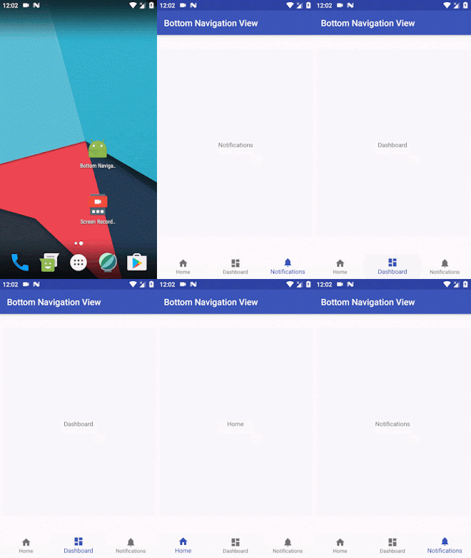
If you add this to your app and run it on your device, you’ll see a shiny new bottom navigation view like below:
5. Handling Enabled/Disabled state
We can easily handle the display of both enabled and disabled menu items.
First, we need to create a selector file for our enabled / disabled colors like following.
app:itemIcontint="@drawable/nav_item_color_state"
app:ItemTextColor="@drawable/nav_item_color_state"
Disabled and Enabled states will then be displayed reflecting the stated look and feel from the selector file:
6.listen to tab selection events
To listen for click events on the BottomNavigationView, we just need to call setOnNavigationItemSelectedListener()
Example of how to do this is:
When we receive click events for the items, we can simply react accordingly. In my sample I simply change the text on the textview that is being displayed on the screen.


Comments
Post a Comment